Retensar H2 (Macro Bears, Fear, Panic)
This indicator use our model to measures the pessimistic mood, pressure to sell / price reduction, shorting, panic and the power of bears in the macroeconomic environment (it does not work with a specific stock but the entire “macro”). We do not think that it is always reasonable to predict the price only on the basis of price and volume, but it is ideal to draw on other data / economic / macro data. That is why this indicator does not draw from the price of the loaded action, but from other data!

It is designed for trading S&P500 indices (ETF SPY, SSO 2x leveraged, SPXL 3x leveraged if you like to take risks), Nasdaq 100 ETF QQQ, Dow Jones Industrial DJI, RUSel 2000, etc. It can be used for the largest stocks that are strongly correlated with the macro and indices or they are their dominant majority component and therefore start to fall when the big index falls.
George Soros said that over time they switched from selecting individual stocks to macro investing, although they continued to buy not only entire indexes, but also individual stocks, looking more at the macro. In one of the few interviews in Jack Schwager’s book Market Wizards, S. Cohen said that one of the few things he was taught in school is that the price of a stock is mainly influenced by macro, industries and to a lesser extent the fundamentals of the stock itself.
That is why we try to predict the coming bad mood, turbulences, shorting, bear power not from the price but from macroeconomic data.
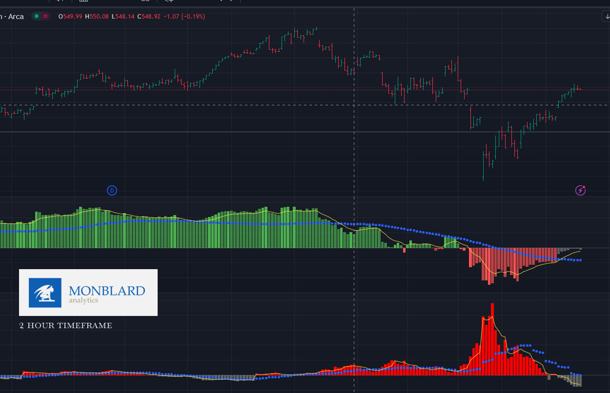
This indicator will show increasing bad mood / bears with red bars. If red columns start to appear, panic or a bad mood usually increases. The higher they are, the worse the panic.
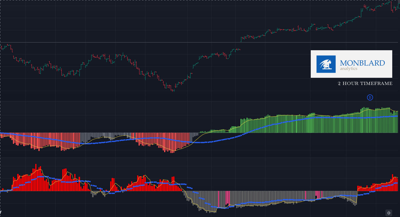
The indicator should be used on 2hours and 1hours timeframe. Rarely, it can also be used on a 4-hour timeframe.
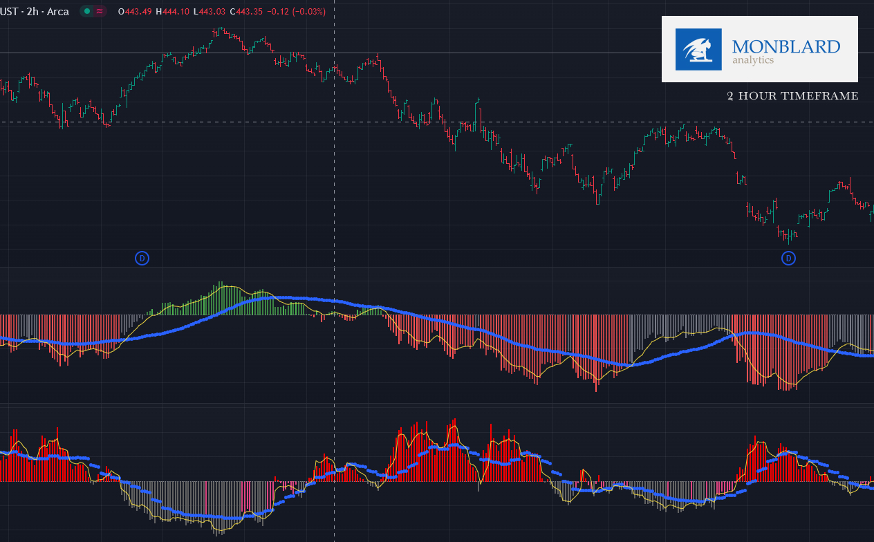
If the bars cross the blue dotted line, bad market sentiment is crossing its medium-term statistical average.
If they exceed the red columns and the yellow line, they also exceed the short-term average.
Also observe the shape and height of the columns and the shape of the wave.

If the bars are below the horizon and are gray + if they are below the blue line and the yellow line, it is the opposite of a bad mood in the markets. If pink columns appear under the horizon, be alert, this is a possible correction and deterioration of the mood. If the columns are below the horizon but shrink (closer to the horizon) below the blue line which is below the horizon, this indicates a worsening of the situation and an increase in bad panic/bears. See videos and articles about this indicator in the members section.

Sometimes, however, it can happen that although possible stress and bad mood in the macro environment is increasing, the index trend is so strong (it is driven by stocks that have a strong representation in the index that they simply continue to push the index up) and this bull trend will overcome even a possible bad mood without corrections. Therefore, use the indicator as an aid in connection with other indicators, strategies and analyses. On the 4 hour timeframe, the power of bears and bad mood is usually so strong that even a strong trend cannot overcome it, and these columns can predict a price collapse, but the higher the timeframe, the more lagging the signal, although this indicator shows the columns in real time!
The indicator does not repaint after close or wait for the candle to close! It works real-time which is great because you can react promptly during candle rendering and you won’t be confused by hindsight like lagging indicators that are rendered only after closing the candle, so they look great in the past but in real time they are not so great.

How we use this indicator:
This is not investment advice or guidance. This artice is only for informational, educational and marketing purpose. We are not financial advisors just data/quant analysts. Read the full disclaimer below. These are just our personal experiences, which please take only as information and possible teaching/education.
You will read these things after purchasing the full version of the indicator:
How (personally) do we use the Next indicator and what do the other lines/graphics represent and how do we understand them? On what timeframe do we use the indicator? Do we use it solo or with other indicators? With what?
On what timeframe do we use the indicator?
What stocks/assets do we (only personally) use the indicator for? (not financial advice)
DISCLAIMER / INFORMATION:
Before using this indicator or any of our strategies, you must read our full disclaimer and agree to our terms and conditions – read them here (click).